Tuesday, August 27, 2013

Data Representation in Geographical Fieldwork

Some useful resources on data techniques from the course today. https://sites.google.com/a/moe.edu.sg/data-representation-workshop/home
e.g the videos on how to use the following:
There were sharing by Unity and Bowen Sec in the use of mGeo for fieldwork in micro-climate study. As mGeo is not available in the android market, I am more interested in the use of Google map in data representation.
To find the latitudes and longitudes of sites which you are collating the data - log onto to Google Map, right click on the location of the site and then click on the green marker and the latitude and longitude will be shown.

The following are the various sites in my school.
Latitude Longitude
Parade Square 1.37523 103.902154
Field 
1.374803
103.901546
Pond 1.374768 103.902581
Canteen 1.37479 103.902141
Basketball court 1.374162 103.902117

A google form is generated for the group to enter the respective data they have created:

The data which the group enter will appear on the spread sheet in Google Doc. Download it as a csv file.

Go to https://mapsengine.google.com/map/u/0/ and click on "new map"
 Click on "import"   

Import the csv file which you have downloaded earlier.


 Click on" Lat of Location" and a pop up menu will appear - click on "Latitude"

  Click on" Long of Location" and a pop up menu will appear - click on "Longitude"


Click on "continue" and then click on " Location" and "Finish"


 Click on "style" to customise the appearance of the layer features on the map.

Click on the arrow key next to "base map" and choose "satellite" from the pop up menu.


Click on "style" then "individual style" and click on "temperatures

 You can then click on "ranges" and the colour you like to represent the temperature.

You can click on "data" to view and edit the data.


Video Turotial:  https://www.youtube.com/watch?v=HZYH36Hbii0

Very interested in creating the heat map and isotherms using GIS - will definitely share on this later as it seems a bit complex now.


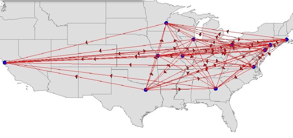
Data representation in tourism


We created Scatter graphs and other graphs using infogr.am.


You can use the following link to calculate how far the country of origin of the tourists are from Singapore:
We created an account @ http://infogr.am/ - click on "create" and then click on any of the infographics template. 


Double click on the text box and type in your title

Delete the chart and add a new one by clicking on "add chart" as shown below.

 Choose the type of graph you want your data to be represented.


Double click to edit the chart.

Clear all the data.


After you cleared all data,  open the excel file as shown below. Copy and paste the data back to infogr.am


You can also create a map with the same data - click on "add a map"


Demo on land transect using Google Map engine - use the polygon to create the polygon indicating the landuse. you can locate the place by using Google map in which you can refer to the street scene to confirm the area which you are plotting is correct.


Sunday, July 21, 2013

Role play game

Saw this on TVBJ MI challenge on 21 July 2013- a competition between 2 groups of students on the topic of GM food. There is a box in the centre which contains strips of paper in which the different roles which they have to assume are written on the papers.

The representative from team 1 will pick up a piece of the paper e.g. scientist - he/she has to talk about GM food assuming the role of a scientist. The representative from team 2 pick up a piece of the paper e.g. local farmer - he/she has to talk about GM food assuming the role of a farmer. Points will be awarded according to the accuracy of the points presented and that it must be relevant to the role they assumed.

Love this idea and would like to share with all of you. As the student assume the different role, they would see GM food in different perspective - both positive and negative. e.g in the show, the "scientist" mentioned how GM food would solve the world food shortage problem and the "local farmer" express concern over the high cost of GM seeds and the competition from farmers who produce GM food crops.

This would also test them to think on their feet as well as to know the content well enough to assume the role they have drawn. 
 
We would also be able to apply this  game to other topics as well.


Tuesday, July 9, 2013

Google Earth - tectonic plates


Kmz file on Tectonic Plates - please ensure you have already downloaded Google Earth. Click and expand Places on the side menu on your left. You should see the placemarks 1 to 6 classified under the 3 types of plate boundaries. Double click on each placemark to find out more about the landforms formed at the respective plate boundaries.
Animation on labeling parts of a composite volcano: - this will help students better understand the parts of a composite volcano.

 The worksheet for the lesson :You might want to also check out the following animations on how volcano and crater lake are formed. 
Volcano
Crater Lake

You can also access the following to better understand types of volcano and damage from earthquakes.
Interesting flash on making your own volcano - understand the difference between a composite and a shield volcano 


Thursday, March 28, 2013

Differentiated instructions

Attending a course on differentiation instructions by Master Teacher Vijaya. Definitely brings about a new understanding on what is DI.
 
Videos on DI available @ http://differentiationcentral.com/videos.html#miscon

The sharing of the implementation of DI on 16 Apr was an enriching session. DI difinitely requires proactive planning and I must say all the presenters have put in a lot of efforts preparing for the DI lessons.
Learned some useful ideas:
One group use potatoes to show contour - of course you have to find one which is asymmetrical to show steep and gentle slope but it is an interesting idea.
 
Another group shared on a lesson based on DI on the economic and social impacts of rising sea level. Different resources are given to the different ability group - one with more photos and another with photos plus write-up which is more guided.


One group which presented a lesson on evaluating the effectiveness of adaptations and responses to earthquakes in various countries. The students were grouped according to their readiness/interest. The weaker group was given short news articles. The gaming group  was given  a laptop to play a game  on natural disasters:   http://www.stopdisastersgame.org/en/home.html The advance group was given the task to research on USGS website, choropleth maps


Friday, March 8, 2013

TWA with Chan Brothers

I went through a 2 Day TWA with Chan Brothers  last year which was a real eye opener on how the tour agency design tour packages to align to the learning of our students. Decided to share this as Annie mentioned that her school is bringing the students to South Korea - something which we touched on during the TWA. 

Humanities Network Sharing 8 March 2013

Quite glad that a few teachers I met @ the humanities network sharing have already made use of the resources I put up on my Geography Blog. My presentation slides below:

Love some of the ideas shared by the others today - overwhelming so I am highlighting a few here:
Dealing With Challenges In A Globalising World by CHIJ (Toa Payoh) (SS) - though the focus is on SS - the team integrated the various discipline including Geog and even Chemistry!
I love the way they integrated the Geog component -esp the graphic mindmap on Global warming - one of the negative impacts of globalisation which we could apply for the topic on climatic changes. 


SS E-learning: Borderless@GESS by Gan Eng Seng School (SS)
Though the focus is on SS - the team has also uploaded topic on Geog for the students' weekly e-learning on current issues related to the subject syllabus. The students are then quiz on the 1st lesson of the following week. 

I love the idea from Annie (Queensway Sec) -Making a Curriculum Artefact – Where’s the Geography? 

She  made use of  a photo essay on "What the world eats, part 1" from Time Magazine online in 2007  (http://www.time.com/time/photogallery/0,29307,1626519_1373664,00.htmland got the students to compare the expenditure made on food in different parts of the world as well as work on the data (calculating average) as well as mapwork based on the photos shown. I like the idea of getting the students to create the map based on the data they have generated. In doing the mapwork, the students will have a better concept of space as well as being able to see the difference in food consumption when they complete the legend for the map.

Extract of the worksheet below: